I came across Worldmapper a couple of years ago while I was preparing a tutorial at the Design Studies Department. For some reason, the images come to my mind once more while listening the politicians (of the actual government) talk about what they have done and why it is important to re-vote them and keep the social/economic model. The country (Argentina) they see is only a construction they create to sustain what they haven’t done.
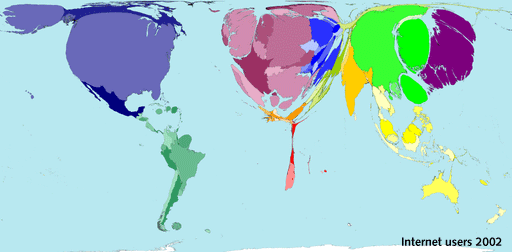
Worldmapper is a collection of 336 different and colorful world maps that vary in shape and size according to certain interests such as Total Population, Land Area, Income per capita, Age-of-death or Internet users among many others. The territories change their size according to specific variables. They state the diverse faces of the world we’re living and represent in many cases obscure reports only shown as statistic data which is often complicated to comprehend. And that are away from the interests of mass media.
«We need new cartographies and new ways of creating them. We have to search for new conceptual instruments and produce new tools that allow us to move in territories in constant change» –Denise Najmanovich
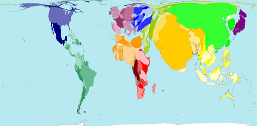
The size of each territory shows the relative proportion of the world's population living there.
In the image you can see a population map. The size of countries like India (yellow), Japan (purple) or China (light green) is remarkable, as well as the small size of countries like Argentina.
Cartographers Danny Dorling and Anna Barford at the University of Sheffield, in the UK started with a bunch of maps that show facts that a few people want to know. When the numbers appear in a spreadsheet generate no emotions. But when we look at the map of HIV infection and Africa is enormous compared to Europe, the image is striking. And the opposite happens when we take the map of public health spending. It is clearly a new vision of the world.
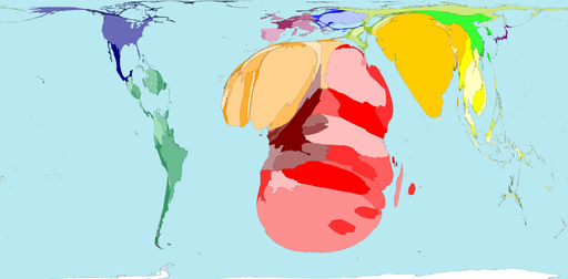
Territory size shows the proportion of all people aged 15-49 with HIV (Human Immunodeficiency Virus) worldwide, living there.
These representations, apart from showing in a very simple way a complex and uneven reality, are a simulation of it, because the reference with the origin is direct (from the numbers to an application that transform then into graphs). They create a thought that is capable of showing the dynamics.
“What I think matters most,” says Prof. Dorling, “are the new ways of thinking that we foster as we redraw the images of the human anatomy of our planet in these ways. What do we need to be able to see — so that we can act?”
And it is sure that we will rethink after confronting with these maps what we often speak about internet being a democratic media that anybody can use to talk to the world, as well as when we talk about globalization and equal possibilities for all of us.