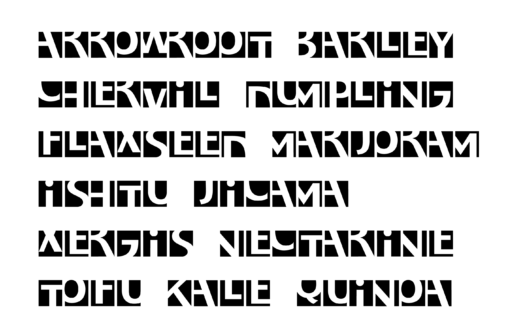
a step beyond sans serif – Experimental typography research

I started this project long time ago, 1992, as part of a research for a Typography paper, at the Buenos Aires University.
At the time I’ve documented the project in a small book, in Spanish. Recently I’ve managed to translate it to English. Link to the book documenting the project
‘Miyuscules is a typographic project done in the context of an undergraduate level 3 elective paper of the Graphic Design degree, FADU, Buenos Aires, Argentina. After 25 years, I have decided to translate my work, originally written in Spanish, in order to share it to a broader community. A part of the original work has been published a couple of times in 1994 (tipoGráfica) and 1996 (Pensamiento Tipográfico) but the complete project has never been published. This project was performed in the context of the early 90s in Buenos Aires, without the easy access to information that the WWW would bring in later years. At the moment I had access to a handful of books that Rubén Fontana shared from his personal library, and I had access to some material that was published in tipoGráfica magazine. Nowadays, an approach to a similar question would probably have more references and further development.
«The design of minimum typographical units was the real purpose of this ‘step beyond the sans serif’. But the formal experiment rapidly gave way to a question of concepts: what are the limits of typographical innovation, what are the historical experiments related to the proposal, and what can we learn from them, to use as a basis for the construction of new structures, and of a new formal convention to identify the same letters we have been handling since the Phoenicians devised phonetic signs. The complete methodology of the process of design was recreated in the definition of each character, on the basis of diverse formal styles: five different families contributed structures on which an independent style was subsequently built. Apart from defining the essence of each character, the job entailed the side issue of the concept of black and white typography introducing a new structural concept, which totally avoids the separation of letterforms and counters.» (Extracted from Typographic Thought. Buenos Aires, Edicial, 1996)’

From the technological side, Miyuscules was produced as a font using Fontographer 3.5 on a 6100 Power Macintosh computer. It was probably the first digital font ever created in Argentina. Recently I’ve created a Ture Type version of the font.
